When homeowners and amateur gardeners envision a stunning landscape design, their minds almost instantly jump to vibrant floral displays. We think of brilliant red roses, cheerful yellow coneflowers, and blazing autumn foliage. While flowers provide breathtaking seasonal bursts of color, professional landscape architects know a profound secret: flowers are fleeting, but foliage is forever.
The hallmark of a high-end, professionally designed landscape is not just what is blooming today, but how permanent plant structures interact every single day of the year. By intentionally incorporating contrasting foliage textures, you can transform a flat, monotonous yard into a sophisticated, dynamic masterpiece with depth, rhythm, and architectural elegance.
Tailored for climates and microclimates across Texas, New York, California, Washington, and San Francisco, this comprehensive guide explores the design principles, plant pairings, and expert tips needed to elevate your landscape using foliage texture contrast.
1. What is Foliage Texture in Landscape Design?
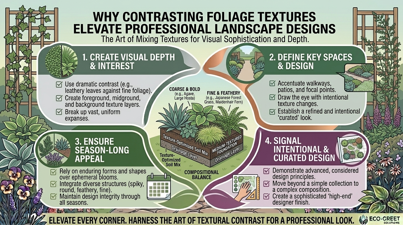
In horticulture and landscape architecture, “texture” does not refer to how a leaf feels to your fingertips. Instead, it refers to the visual weight and grain of a plant as perceived from a distance. Texture is categorized into three primary tiers:
- Coarse (Bold) Texture: Plants featuring large leaves, broad blades, heavy structural stems, or dramatic patterns (e.g., Hostas, Gunnera, Agave, or Fan Palms). Coarse textures command immediate attention, act as visual anchors, and create a sense of drama or tropical lushness.
- Medium Texture: The baseline standard of the plant kingdom. These plants feature average-sized leaves with smooth, unobtrusive margins (e.g., boxwoods, many viburnums, and standard deciduous shrubs). They serve as the connective tissue that bridges fine and coarse elements.
- Fine Texture: Plants with delicate, wispy, needle-like, or heavily divided foliage (e.g., ornamental grasses, Japanese maples, ferns, and threadleaf coreopsis). Fine textures create a sense of movement, softness, and atmospheric haze.
2. Why Texture Contrast Elevates Professional Landscapes
Relying solely on plant color (like a bed of monochromatic green shrubs) often results in a visually tiring, flat landscape. Integrating texture contrast unlocks powerful design benefits:
- Creates Depth and Perspective: Coarse textures visually advance toward the viewer, while fine textures recede. Mixing them tricks the eye, making smaller yards feel expansive and large yards feel intimate and structured.
- Sustains Year-Round Visual Interest: Flowers last only a few weeks, but leaf structures persist through spring, summer, autumn, and even winter dormancy, maintaining a polished aesthetic.
- Highlights Architectural Lines: Strategic contrast draws the eye toward focal points, entryways, pathways, and water features.
- Enhances Minimalism and Modernity: Modern landscape design relies heavily on monochromatic color palettes (greens, grays, and silvers); therefore, contrasting textures do the heavy lifting to keep minimalist designs exciting.
3. Regional Plant Combinations: Texture in Action
Different regional climates require different plant palettes. Here is how professional designers pair contrasting foliage textures across your target locations:
Texas (Heat and Drought Adaptation)
- The Contrast Pairing: Pair the massive, architectural, coarse-textured rosette of the Century Plant (Agave americana) or Soft Leaf Yucca against the delicate, cloud-like, fine texture of Gulf Coast Muhly Grass (Muhlenbergia capillaris).
- The Effect: The rigid, sculptural weight of the agave pops dramatically against the soft, feathery haze of the ornamental grass, all while surviving extreme Texas heat.
New York (Four-Season Deciduous Contrast)
- The Contrast Pairing: Combine the massive, heart-shaped coarse foliage of Hosta ‘Sum and Substance’ with the finely dissected, lacy, fine texture of a Japanese Maple (Acer palmatum) or Autum Fern.
- The Effect: The bold, tropical-feeling hosta leaves anchor shady beds, while the delicate, weeping red or green laceleaf maple provides intricate, high-contrast canopy movement.
California (Mediterranean Architectural Style)
- The Contrast Pairing: Interplant the broad, leathery, medium-to-coarse leaves of Strelitzia nicolai (Giant Bird of Paradise) or Proteas with the fine, needle-like silver foliage of Lavender or Rosmarinus officinalis.
- The Effect: Captures a high-end Mediterranean resort aesthetic by balancing structural broad leaves with aromatic, fine-textured lines.
Washington (Pacific Northwest Damp Woodland Style)
- The Contrast Pairing: Layer the massive, prehistoric fronds of the Deer Fern or Sword Fern alongside the broad, glossy, medium-coarse leaves of Pacific Rhododendrons or Skimmia.
- The Effect: Replicates a lush, multi-layered temperate rainforest floor with rich structural depth.
San Francisco (Coastal Microclimate Sophistication)
- The Contrast Pairing: Pair spiky, coarse New Zealand Flax (Phormium) with wispy, fine Blue Oat Grass (Helictotrichon sempervirens) or Aeoniums.
- The Effect: Clean architectural lines that withstand coastal winds and fog while delivering striking modern contrast.
4. Top 10 Expert Tips for Mastering Foliage Contrast
- The Rule of Three: Do not crowd a garden bed with dozens of competing textures. Stick to a primary texture for the bulk of the bed, a secondary texture for contrast, and a rare accent texture for punctuation.
- Anchor with Coarse Elements First: Place your boldest, coarse-textured plants first. Think of them as the “anchors” or focal points of your composition, then weave fine-textured plants around them.
- Use Fine Textures to Create Softness: If your landscape features hard architectural elements (concrete walls, brick patios, or straight fences), use fine-textured ornamental grasses or ferns to soften harsh lines.
- Consider Light Play: Fine textures catch and scatter light (creating a glowing, translucent haze), while coarse textures absorb light and cast deep, dramatic shadows. Use this interplay to manipulate bright sunny spots or dark corners.
- Don’t Forget Color Subtlety: Texture contrast works best when combined with subtle color variation. Pair a silvery-gray fine texture with a dark green coarse texture to maximize visual pop.
- Scale to Space: Match texture size to your viewing distance. Bold, coarse textures (like large agaves or banana plants) look best viewed from afar or along major walkways, while fine textures shine up close near entryways.
- Transition Gradually: Avoid jarring jumps from extremely fine to ultra-coarse unless making a deliberate focal point statement. Use medium-textured shrubs as a bridge between contrasting extremes.
- Highlight Walkways and Entries: Place high-contrast texture pairings near front doors, gates, and pathways where visitors naturally slow down to appreciate the detail.
- Leverage Vertical vs. Horizontal Lines: Texture isn’t just leaf size; it’s growth habit. Pair upright, vertical spires with mounding, spilling, or weeping habits for added depth.
- Review in Winter: Step outside during winter dormancy. If your landscape looks lifeless, you lack sufficient evergreen structural textures and woody branch variation.
10 Frequently Asked Questions (FAQ)
1. What is the difference between fine and coarse texture in plants?
Coarse texture refers to large, bold leaves or heavy structural forms (like hostas or palms) that draw the eye immediately. Fine texture refers to wispy, narrow, or deeply divided foliage (like ferns or grasses) that creates a soft, hazy appearance.
2. Can I use texture contrast in a monochromatic (all-green) garden?
Absolutely! In fact, professional designers often rely on all-green palettes, using variations in leaf shape, sheen, and texture to create elegance without relying on flower colors.
3. How do I start designing a texture-contrasted garden bed?
Begin by selecting one anchor plant with a bold, coarse texture. Then, surround it with plants featuring contrasting medium and fine textures, ensuring you repeat those choices across the garden for rhythm.
4. Do fine-textured plants require more maintenance?
Not necessarily. Many fine-textured plants, like ornamental grasses or drought-tolerant herbs, are remarkably hardy and low-maintenance once established.
5. How does texture affect the perceived size of a small yard?
Coarse textures visually advance, making a small space feel closer and more intimate. Fine textures recede, creating an optical illusion of depth that makes small yards feel larger.
6. What are some classic shade-loving texture pairings?
Pairing the massive, broad leaves of shade-loving perennials (like Brunnera or large Hostas) with the delicate, lacy fronds of Maidenhair ferns or bleeding hearts creates a classic woodland contrast.
7. Can I mix tropical textures in arid climates like Texas or California?
Yes, by using climate-adapted succulent alternatives (like Agaves, yuccas, and aloes) that mimic tropical bold textures while thriving in dry heat.
8. How do hardscapes influence plant texture choices?
Harsh, geometric hardscapes (like concrete or smooth stone) benefit greatly from fine-textured, spilling plants that break up rigid lines and soften the environment.
9. Why does my landscape look flat even though I have many plants?
If all your plants share the same leaf size, shape, and growth habit (e.g., a row of medium rounded green shrubs), your eye perceives it as a single flat wall of green, regardless of how many individual plants are present.
10. How do I maintain texture balance through seasonal changes?
Incorporate a healthy mix of evergreen structural plants (conifers, boxwoods, or broadleaf evergreens) alongside deciduous perennials so your texture contrast remains intact even after autumn leaf drop.
Conclusion
Elevating your landscape from ordinary to professional does not require endless hours of deadheading flowers or expensive installation overhauls. By mastering the art of contrasting foliage textures, you introduce structural depth, architectural sophistication, and permanent year-round interest to your outdoor space. Whether you are designing a sleek San Francisco urban courtyard, a lush Washington woodland, or a sun-drenched Texas patio, blending bold coarse elements with delicate fine foliage is the ultimate secret to a polished, high-end landscape design. Start evaluating your yard’s textures today and build a living canvas that looks professionally curated 365 days a year.